Coffee brand identity · 2024
A roastery that sounds like its neighborhood
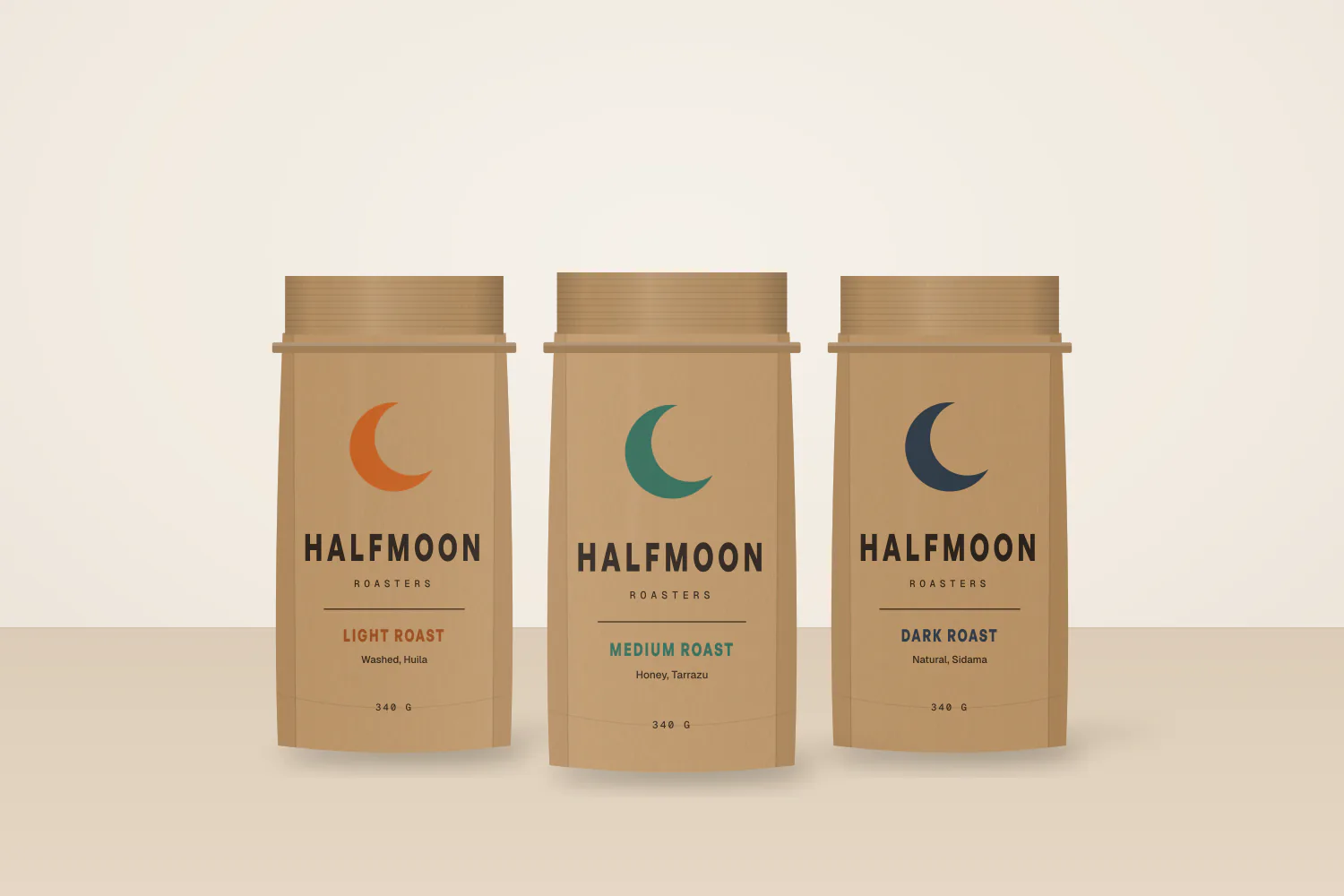
An identity that keeps the crescent the regulars loved and gives it the discipline wholesale needs: a redrawn mark, a three-color system keyed to roast level, and bags that read from across a café counter.
- Client
- Halfmoon Roasters
- By
- Studio Orrin
- Timeline
- 10 weeks
- Year
- 2024
The problem
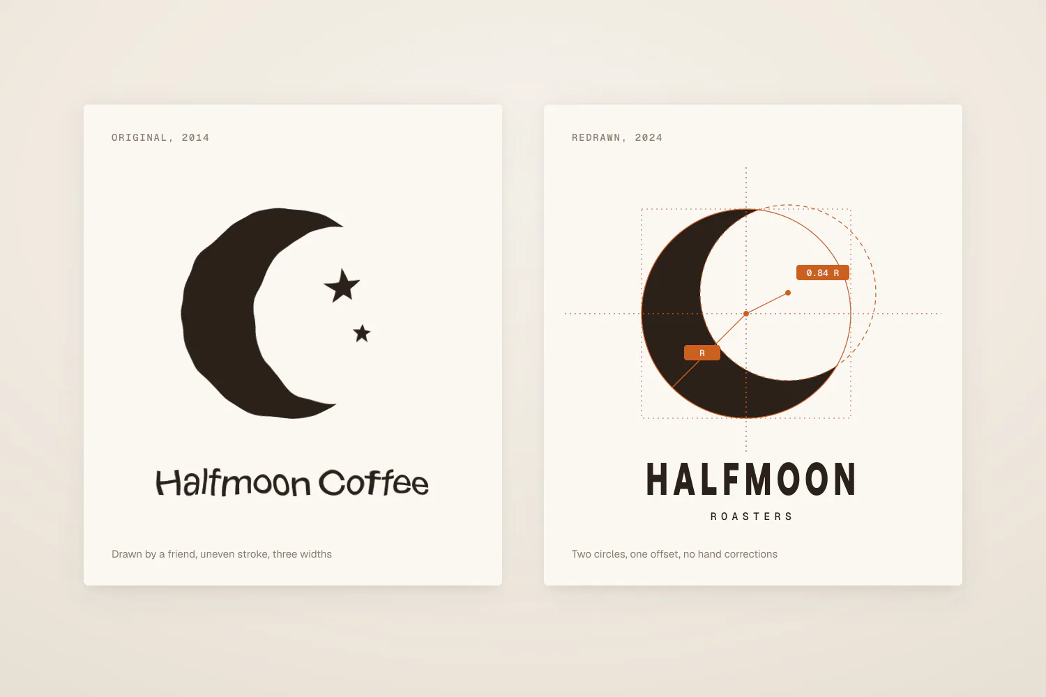
A ten-year-old roastery had outgrown a logo drawn by a friend. Wholesale buyers mistook it for a hobby, but regulars loved the old mark.
My role
Two-person studio, identity and packaging
Constraints
- The roaster's bag supplier prints two colors on kraft, nothing more.
- The crescent had to stay. The owners were clear about that on day one.
- Launch had to land before the holiday wholesale catalog.
Decision 01
Kept the crescent, redrew everything around it
We traced the original crescent, corrected its curves, and paired it with a condensed wordmark set wide.
Why
Regulars identified the shop by the moon. Replacing it would have spent ten years of recognition to fix a problem of craft.
Decision 02
Tied color to roast, not to origin
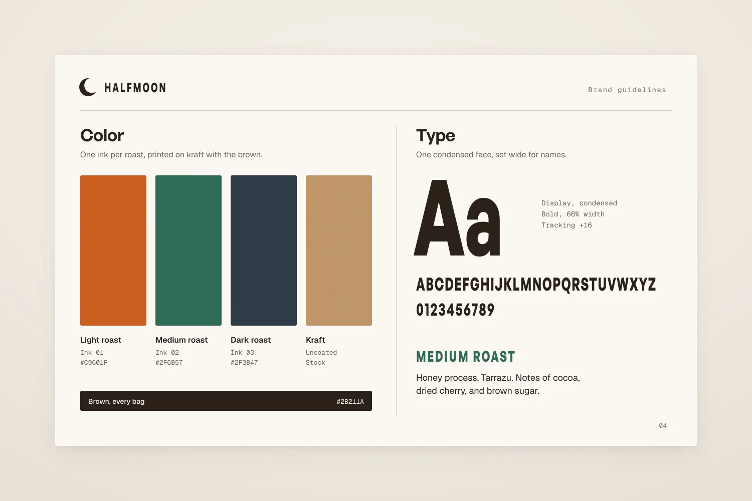
Three inks, one per roast level, so a café owner can stock a shelf by color alone.
Why
Wholesale buyers order by roast. Origin stories live on the back of the bag where people actually read them.
Decision 03
Designed for two colors on kraft first
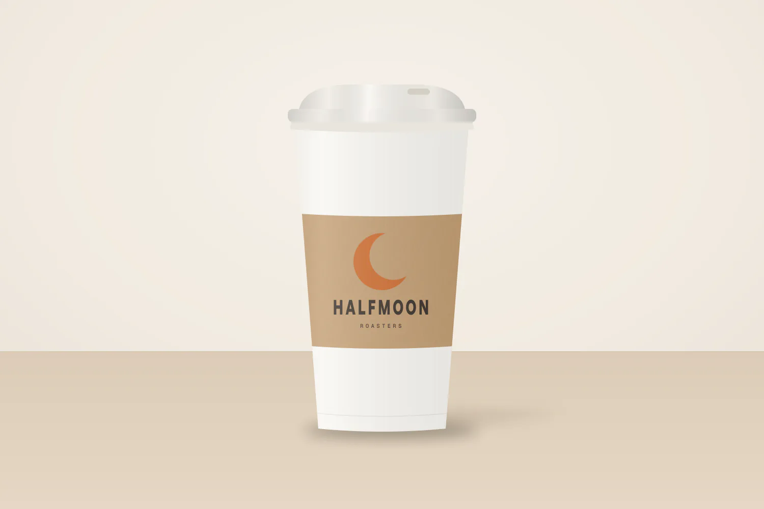
Every application was drawn in two flat colors on brown paper before anything else.
Why
If the bag worked within the supplier's limits, every other surface would be easier, not harder.
The outcome
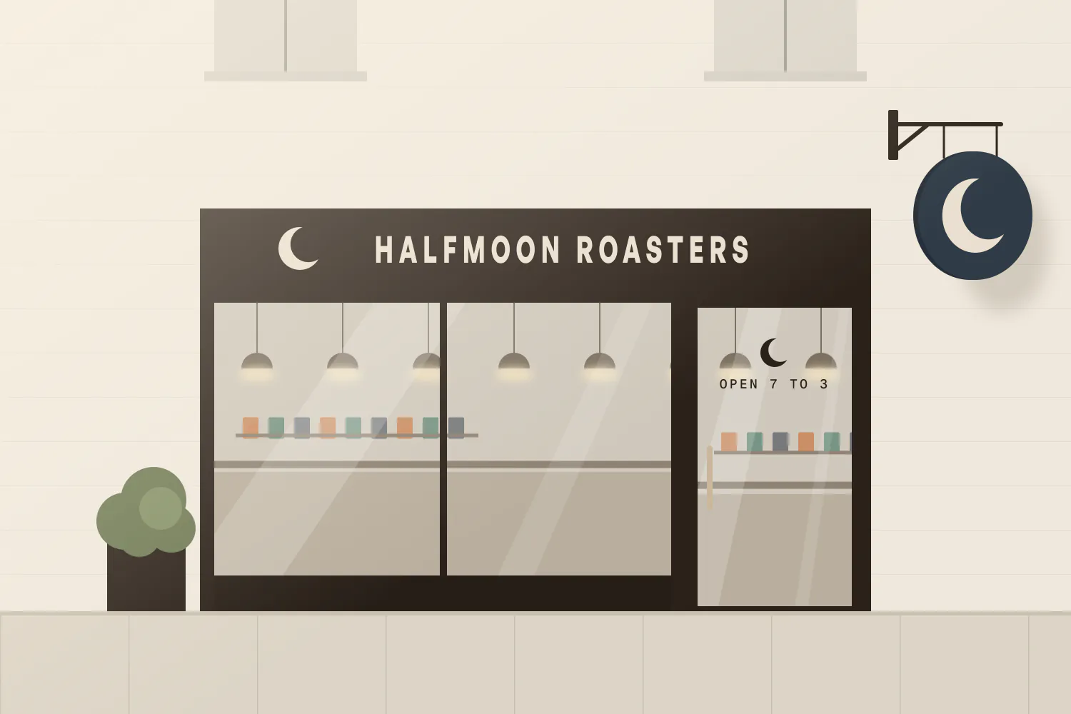
Launched in November 2024 across bags, cups, and the storefront. The owners told us wholesale inquiries roughly doubled over the following quarter; we do not have their exact numbers.
Next: Harbor Museum of Craft, museum wayfinding systemAn illustrative case study. Studio Orrin and Halfmoon Roasters are fictional, and so are the numbers, which stand in for figures a real designer would supply. Casepanorama never invents them.